History
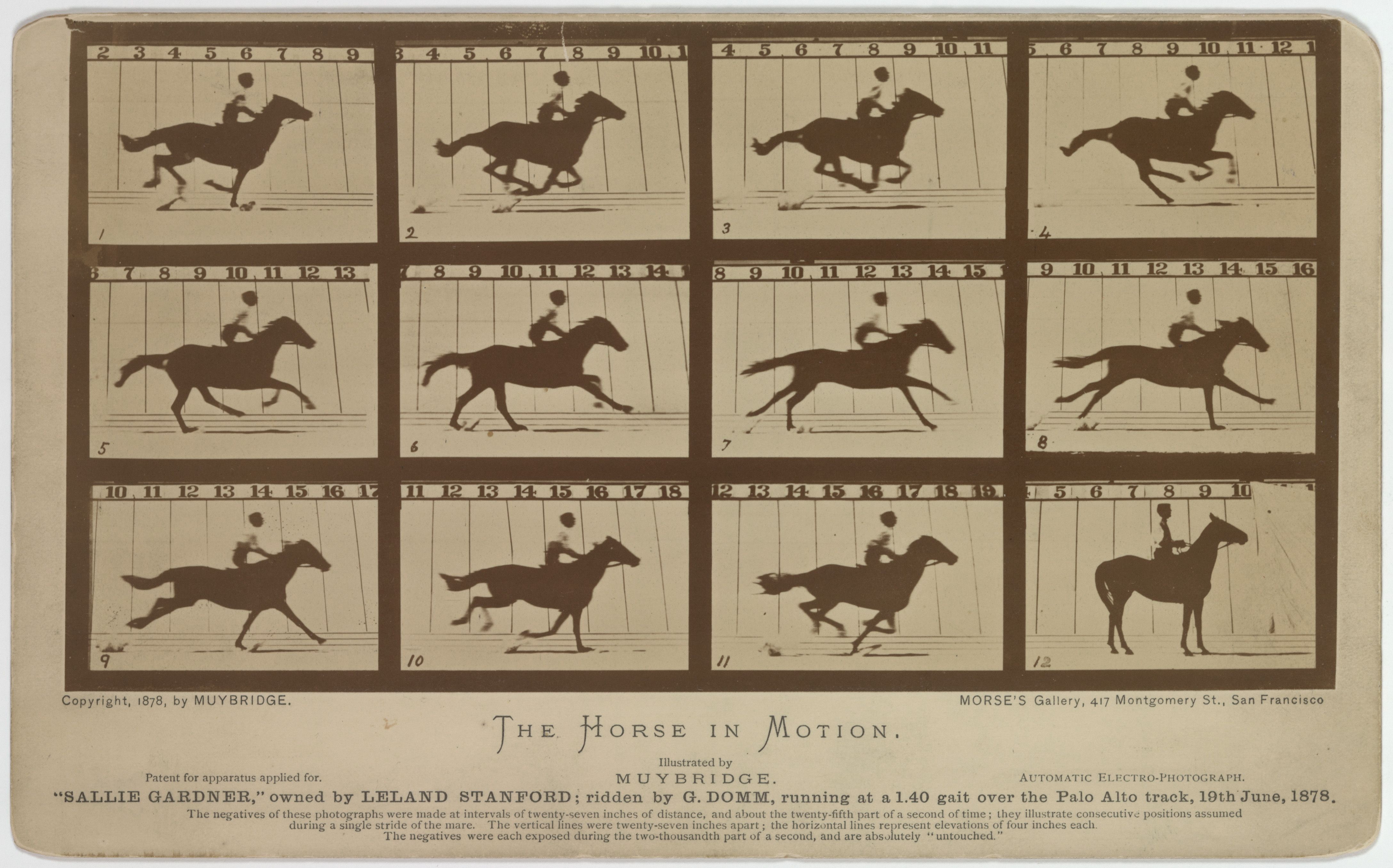
Eadweard Muybridge’s sequence of “Sallie Gardner”, recorded on 19 June 1878, divides a galloping horse into twelve distinct instants rather than freezing the movement in a single image. The photographs are arranged on one card in three rows of four. Horse and rider remain at a comparable scale across the frames, while the positions of the legs change. A brief movement becomes a set of small differences that can be compared side by side.
The force of the card comes from more than the successive poses. Vertical measuring lines in the background, numbered frames and the explanatory text beneath them make it difficult to read these as casually captured photographs. Photography has become an instrument of observation. Keeping the horse’s body in a consistent visual field makes it possible to compare the angles of the legs, the transfer of weight and the contact of the hooves with the ground. Repetition is what makes each small difference visible.
The work began with Leland Stanford’s question about whether a galloping horse ever lifts all four hooves clear of the ground. Muybridge used a series of cameras triggered in succession along the track to record the movement at separate instants. The resulting photographs revealed an airborne phase, while also challenging the familiar painted convention of a “flying” horse with forelegs and hind legs stretched in opposite directions. The shape of a body in rapid motion was not necessarily the shape that an observer imagined from continuous sight.
Look more closely and the series is also solving a problem of graphic organisation. Each of the twelve images supplies incomplete information on its own; meaning emerges through sequence and comparison. Dark borders divide the frames decisively, numbers fix the order, and a repeated ground line gives the viewer a stable reference. Although the horse moves, the viewing field on the card remains controlled. Motion is therefore made legible through differences within a consistent arrangement.
The sequence is often discussed in relation to the origins of cinema, but the printed card does not need to be mistaken for a projected moving image to remain compelling. Here, time is divided into parts that can be measured and studied before it is presented as a flowing picture. A further look might settle on the instant a hoof leaves the ground, the comparatively steady position of the rider, or the way the background grid turns an image into evidence. That combination of measurement and representation is what gives the object its continuing interest.
Image: Eadweard Muybridge, The Horse in Motion (“Sallie Gardner”), 1878; Library of Congress / Wikimedia Commons, public domain.
Places
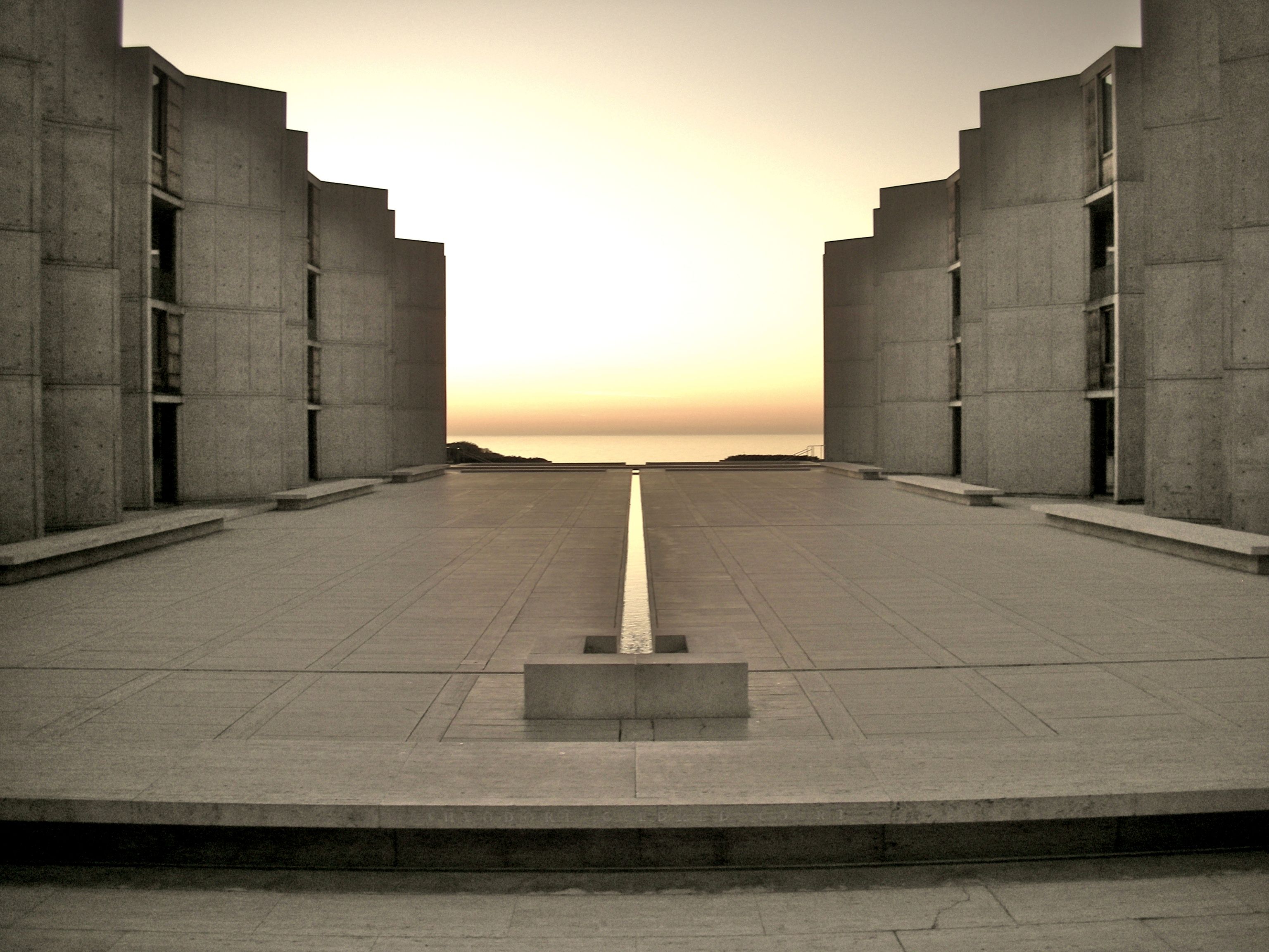
One of the clearest organising elements in the courtyard of Louis I. Kahn’s Salk Institute in La Jolla is a narrow water channel set into its travertine paving. The concrete laboratory buildings form powerful boundaries on either side, yet the eye is directed less by their mass than by this fine line in the ground. Running from east to west, the channel aligns with the opening towards the Pacific horizon.
The contrast in scale is unusually precise. An expansive stone surface and heavy concrete elevations make the narrowness of the channel immediately legible. Keeping the courtyard largely unoccupied reinforces that relationship. There is no garden feature or sculpture to arrest the gaze; instead, it moves among the paving joints, the repeated building modules and the direction of the water. The architecture establishes perspective from either side, while the channel gives that perspective one continuous axis.
The water line differs from an ornamental pool. Contained within a shallow cut in the paving, its surface can read almost like another piece of stone or, when it catches the light, as a bright strip. At sunset the relationship between that line and the horizontal sea beyond becomes particularly clear. The water need not physically reach the ocean for the connection to work. The eye follows a direction that links the carefully measured courtyard to a much larger landscape. An outdoor space enclosed on two sides is therefore completed by an open horizon at one end.
The Institute calls the feature the “River of Life”, associating it with the movement of scientific discoveries into a wider body of knowledge. The metaphor is carried by the spatial arrangement itself: a line beginning among laboratories points beyond their boundaries. It also has an actual technical system behind it, with water circulated through the feature. According to the Institute, the sun sets along its axis at the spring and autumn equinoxes, adding a seasonal dimension to the fixed geometry.
This is worth returning to because a single detail works at several scales. It is a functioning water channel, the geometric spine of the courtyard and a visual connection to the setting. Material, infrastructure, direction and meaning meet in one restrained decision. Studying it reveals how little an architectural intervention needs to occupy physically in order to organise a considerable amount of space.
Image: TheNose (Alfred Essa), Salk Institute courtyard, 2006; Wikimedia Commons, CC BY-SA 2.0.
Culture
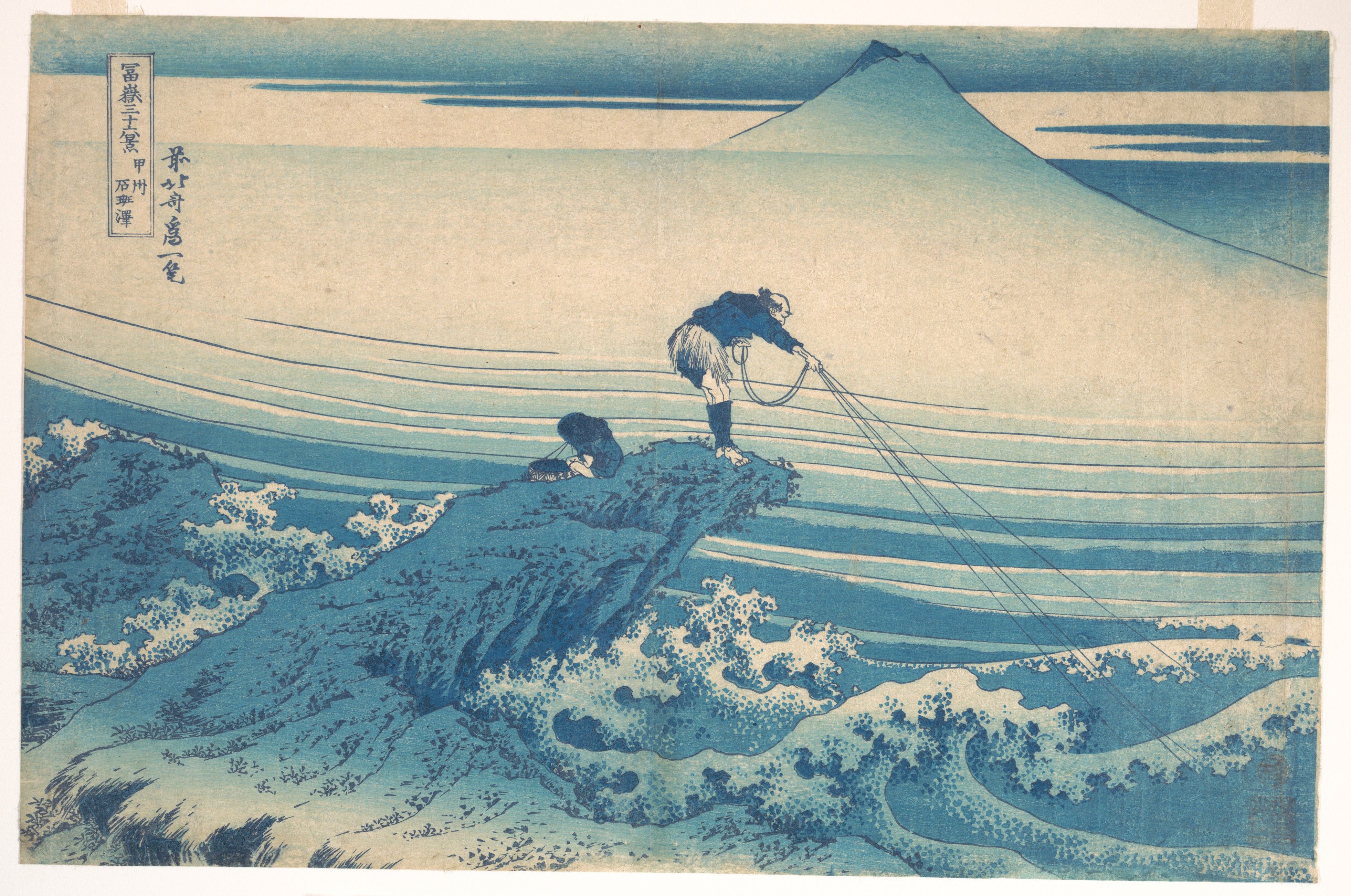
In Kajikazawa, from Hokusai’s Thirty-six Views of Mount Fuji, the immediate subject is an ordinary activity by a river: a fisherman leaning forward at the edge of a rock, a smaller seated figure beside him, and water moving below. Mount Fuji stands far away, almost quiet in the background. The print’s underlying structure lies in the formal relationship between these two very different scales.
The fishing lines descending towards the water, the bend of the fisherman’s body and the pointed outcrop form a clear triangle. The slopes of Fuji repeat the same geometry at a distance. The eye does not simply travel from the foreground figure towards a deep horizon; it recognises one triangular arrangement in another. Rather than relying on a ready-made symbol of humanity and nature, Hokusai connects two separated spaces through a shared organisation of lines.
Movement is equally controlled. The fine diagonals of the taut lines cross the near-horizontal bands of the river. Water runs in broad stripes, while the sharp projection of the rock pushes decisively to the right. The fisherman’s leaning posture continues that direction; the seated figure introduces a brief pause within it. Without enlarging a single dramatic gesture, the print conveys bodily weight and the river’s force through a remarkably economical sequence of contours.
Colour strengthens these connections. Deep blue appears in the fisherman’s clothing, at the point of the rocky foreground and at the summit of Fuji, joining three otherwise distant parts of the image. Soft gradations across the open areas are held against the precision of the carved outlines. The blue emphasis of early impressions of the print is therefore doing more than describing atmosphere: it gives the image a visual structure across depth.
The print measures only around 25 by 38 centimetres. Within that relatively modest surface, the sense of distance and movement comes from the relationships among a few decisive marks. Kajikazawa rewards another look because its most significant feature is not the grandeur of the landscape, but the way its lines meet and recur. Following the fisherman’s lines towards the water eventually returns the eye to the slopes of Fuji.
Image: Katsushika Hokusai, Kajikazawa in Kai Province, ca. 1830–32; The Metropolitan Museum of Art, JP2581, public domain / CC0.
Technology
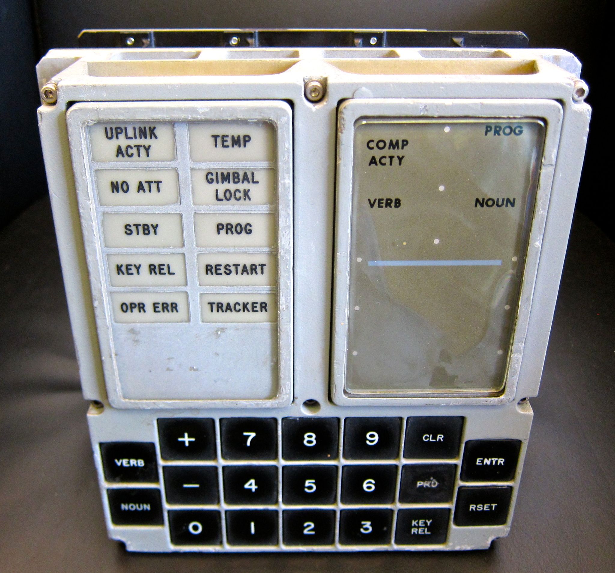
One of the most visible points of contact between the Apollo programme and its computers was the DSKY panel in the cockpit. The unit in this photograph was removed from a Command Module training simulator at Johnson Space Center. The worn edges, faded display surface and marks of use make it more revealing than a pristine catalogue image. It is an instrument built for the repetition of procedures, not for display.
The front is divided into three clearly legible areas: status and warning indicators on the left, programme and numerical readouts on the right, and a keypad below. Two of the keys are labelled VERB and NOUN, an unusually direct account of how the interface works. An astronaut did not compose an instruction in ordinary language. A two-digit verb code identified the desired operation; a two-digit noun code identified the associated data. The computer was addressed through a deliberately limited, predefined vocabulary.
By the standards of contemporary screens, very little seems to be present. Yet a small number of controls does not automatically make a system easy to use. DSKY codes had to be learnt, their meanings understood and the results checked against mission procedures. Complexity had not disappeared; much of it had moved into training, conventions and the sequence of work. The distinction matters whenever visual simplicity is confused with intuitive operation.
The panel’s hierarchy is correspondingly precise. Dedicated indicators such as UPLINK ACTY, GIMBAL LOCK and OPR ERR are kept separate from ordinary numerical information. White labels against the dark keys distinguish the digits from operations such as VERB, NOUN, ENTR and CLR. Rather than presenting every possible choice at once, the interface communicates what action is being requested and what condition the system is in through a small set of unambiguous signals. Its visual restraint is inseparable from the discipline of the task.
The reason to return to DSKY is more substantial than nostalgia for early computers. Each component makes visible a particular exchange of information between person and machine. The price is dependence on learnt codes and procedures. The gain is an interface in which command, response and error occupy recognisably different places, instead of dissolving into a single screen. The panel is small; the decisions passing through it were not.
Photograph: Steve Jurvetson / Wikimedia Commons, CC BY 2.0. The image shows a DSKY unit removed from an Apollo Command Module training simulator.
Design
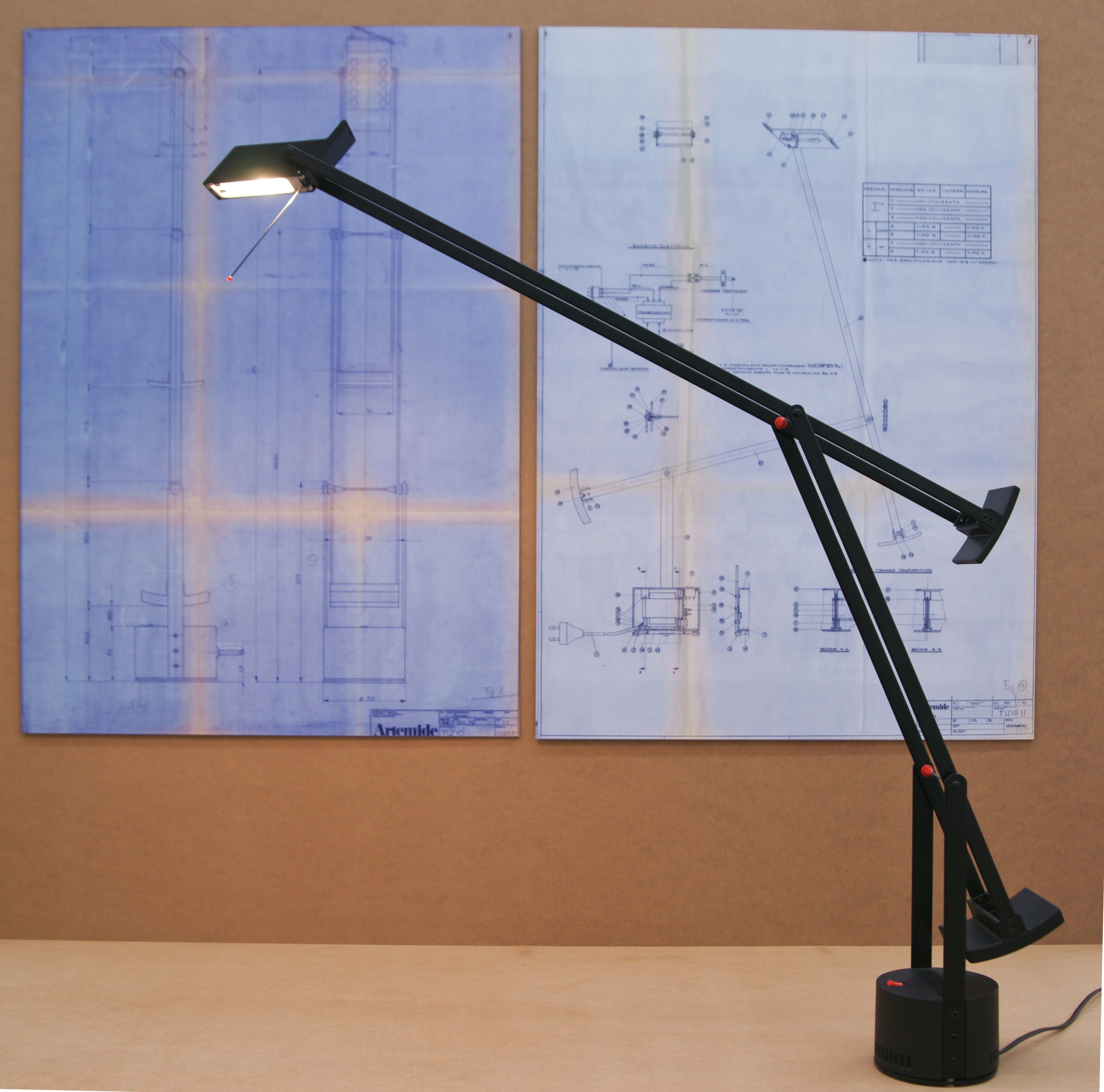
From a distance, Tizio first reads as a pair of thin black arms and an almost diagrammatic silhouette. Up close, however, its real subject is mechanism rather than form. In Richard Sapper’s desk lamp for Artemide, the base is not simply a support: it contains the transformer and acts as the centre of gravity. The two long arms do more than carry the light head; they also conduct electricity. No separate wire needs to run visibly along the structure. Support, power and movement are therefore resolved as one system.
The most instructive part of the lamp is its counterweight arrangement. The proportions of the joints and weights allow the head to be repositioned with very little force and to remain where it is left. Long before “user experience” became a design phrase, this was a very physical ergonomic problem. Sapper wanted a work lamp that did not need to be clamped to the desk, could reach across a broad working area and still occupy little space at its base. Tizio turns that requirement directly into form: mass is concentrated low, while movement becomes progressively lighter above it.
Using the arms themselves to carry current is not merely a technical trick. It is a decision that reduces visual noise. The lamp does not hide how it works; the forces, pivots and counterweights remain legible. Yet there is no unnecessary cable, spring or decorative component competing for attention. Tizio therefore becomes simple not by removing parts for the sake of a minimal appearance, but by asking each part to perform more than one task. That is a recurring quality in strong industrial design: visual economy arrives as the consequence of a well-resolved system.
The small, concentrated light head follows the same logic. When the lamp entered production in 1972, a halogen source was still unusual in a domestic desk lamp. A compact reflector could deliver a precise, intense pool of light without requiring a large shade. That keeps the long arms visually light and preserves the sense that the lamp is more like an articulated instrument than a piece of furniture. The black structure and restrained red accents reinforce this reading. Colour is not decoration; it acts as a minor piece of interface information within the mechanism.
Tizio is worth returning to not because it became an icon, but because it solves several difficult problems at once: balance, reach, power transmission, footprint and precise direction of light. Its character is not a style applied after those problems were solved; it emerges from the solution itself. More than fifty years later, it still does not need nostalgia to remain convincing. Its longevity comes from the clarity of the relationship between form and mechanism.
Design
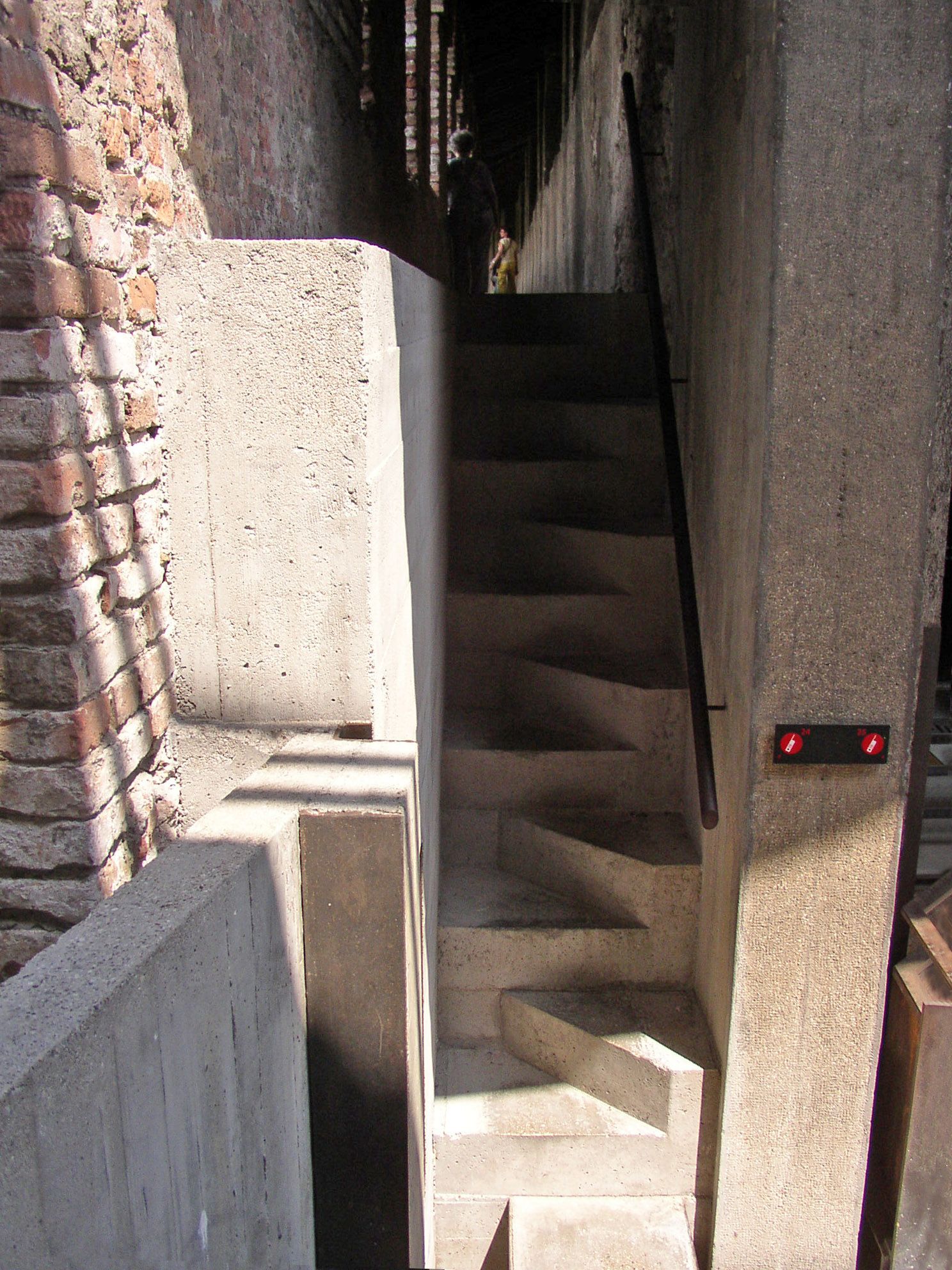
This small stair at Castelvecchio shows why Carlo Scarpa is remembered not only for large spatial decisions, but for the moments of transition between them. Its practical task is modest: it provides access to a semi-covered passage. Yet the stone treads do not rise as one regular flight. They are staggered, each step shifting slightly from the axis of the one below. That small displacement turns an ordinary piece of circulation into a threshold in which movement becomes perceptible.
The asymmetry is not theatrical. At first it can almost appear incidental, but the stagger changes both the rhythm of walking and the way the stair meets the wall. A conventional flight could be read as one continuous diagonal. Here the individual treads remain distinct, so ascent is experienced less as a single gesture than as a sequence of small adjustments. The stair does not merely move the visitor to another level; it makes the act of transition itself part of the museum experience. Function and perception are not treated as separate problems.
The detail also makes sense within the broader logic of Scarpa’s Castelvecchio restoration. He did not try to complete the historic fabric as if the new work had always been there, nor did he disguise contemporary interventions in a medieval language. New elements remain legible as new, while the weight and texture of the existing walls are allowed to retain their presence. In this stair, the clean geometry of the stone treads sits beside the irregular surface of old brick. The two periods are not forced into visual imitation; their contact makes each more readable.
The same principle appears in the metal details. Thin, dark lines behave almost like drawing against the mass of stone and masonry. This contrast — heavy and light, rough and precise, old and new — is not decorative. It helps explain how the intervention has been assembled and which parts belong to different moments in the building’s history. Detail becomes a way of preserving historical legibility rather than merely refining appearance.
What makes the stair worth returning to is its scale. A very small design decision is capable of expressing the attitude of the entire restoration. Conservation here does not mean imitation; it means allowing the new work to belong clearly to its own time without suppressing the old. A few displaced treads are enough to alter movement, sightlines and the relationship between materials. Scarpa’s strength often appears at precisely this level: the detail never becomes an isolated flourish, yet the larger architectural idea can still be read within it.
Design
Playing a song today is almost an invisible gesture. We touch a screen and sound begins. A machine such as the ITT SL 59 Automatic recalls a time when listening and recording were far more physical acts: taking the cassette in your hand, opening the compartment, placing the tape, pressing a genuinely mechanical key and waiting for the reels to begin turning. Sound was not only something heard; it was the result of a small ritual.
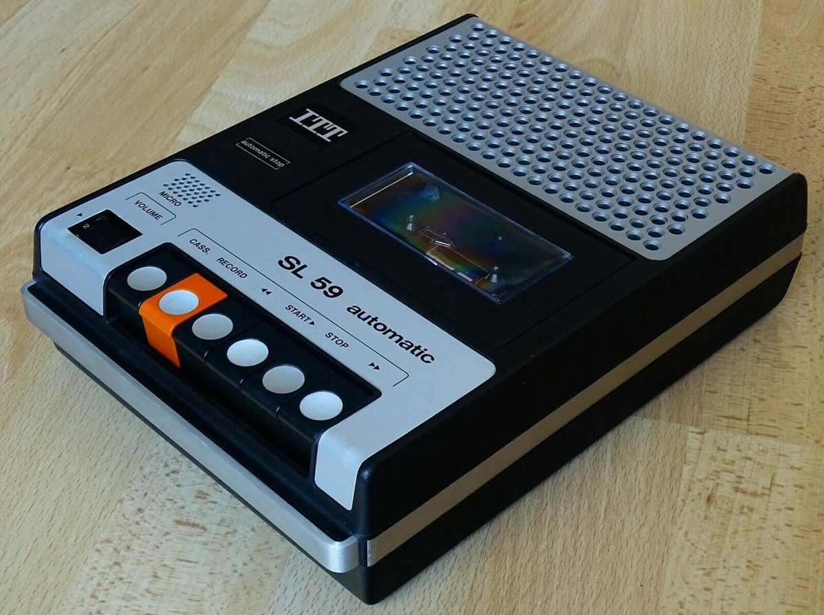
Released in 1979, the SL 59 is striking for its mechanical honesty. It makes no attempt to conceal what it does. A broad perforated metal speaker grille occupies the upper section, beside a transparent window that makes the cassette itself visible. Below sits a row of substantial controls, each assigned to a distinct physical action. The orange record key is more than a graphic accent: it establishes a clear hierarchy at a glance and reduces the chance of an accidental recording. Against the black, silver and off-white body, that single colour is enough to organise the entire interface.
Technically the SL 59 was a modest portable monophonic cassette recorder: a two-head, single-channel mechanism using standard Type I cassette tape at 4.76 cm/s, with a built-in microphone and automatic stop. It could run from mains power or five C-cell batteries. None of these specifications is remarkable on its own. What makes the object more interesting today is the brief moment it represents, when analogue audio culture and the emerging personal-computer age overlapped. Its rear DIN connection also made recorders of this type suitable for loading data into early home computers such as the BBC Micro, Acorn Electron and Sinclair machines.
That overlap makes the cassette a more unusual object than nostalgia sometimes allows. The same magnetic tape could contain a song, a recorded conversation or a computer program. Music and data had not yet become completely separate worlds. A recorder used by one child to capture a favourite song from the radio could sit on another desk as part of a home-computing setup. The same mechanism could carry both personal memory and early digital information.
The SL 59 also embodies the visual language of that transitional period. It is not minimalist in the contemporary sense, yet almost every element explains its purpose. The speaker looks like a speaker, the cassette mechanism remains visible, and the controls visibly move. In contrast with today's increasingly seamless interfaces, there is an unusually direct relationship between form and function.
That may be why the SL 59 remains appealing. It was not a heroic object designed to announce the future. In its own time it was an ordinary, accessible domestic tool. Seen now, however, it captures a very particular technological moment at the end of the 1970s and beginning of the 1980s: mechanical buttons, magnetic tape and the first generation of personal computers sharing the same desk. Some objects are worth returning to not because they became icons, but because they quietly preserve the texture of everyday life from another era.
Design
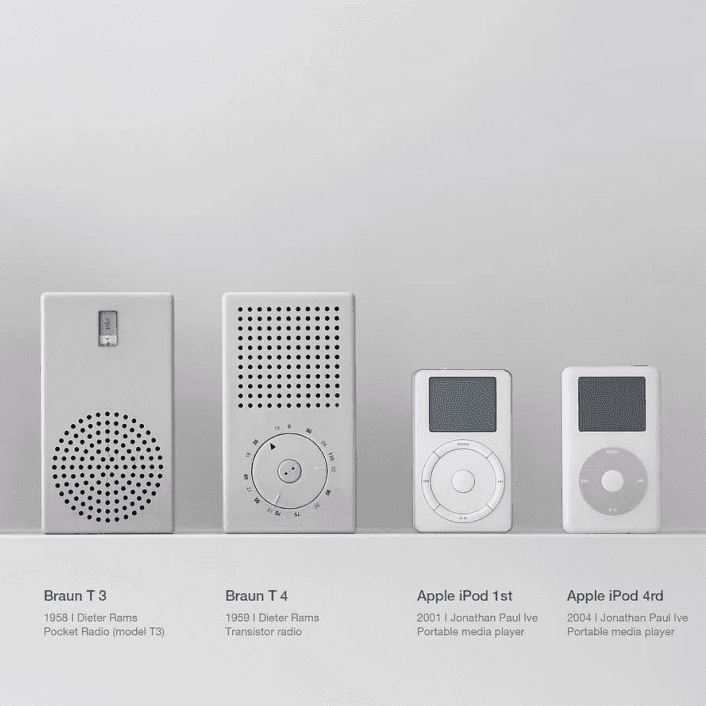
The resemblance between Dieter Rams and Apple is more than a question of formal borrowing. What truly matters is the design culture Rams developed at Braun — clarity, hierarchy, restraint, legibility and a calm user-centred aesthetic — and the way it found a contemporary reinterpretation at Apple, particularly during the Jony Ive era.
The kinship between the Braun ET66 and Apple’s calculator interface, or between Rams’s radios and audio devices and products such as the iPod and iPhone, is too strong to dismiss as coincidence. The connection is less about copying forms one by one than about proportion, surface logic, interface thinking, colour economy and the relationship established with the user.
What makes the comparison valuable is that it shows good design as a set of principles rather than a surface style. Rams’s “less, but better” becomes product clarity at Apple: an object should communicate its use, reduce cognitive noise and avoid allowing form to overpower function.
Yet an important difference remains. Rams’s design ethic is more explicitly tied to durability, longevity and a critique of consumption, while Apple does not always meet the same ethical standard. The relationship is therefore not only one of resemblance, but also of tension — and that tension makes the comparison more revealing.
Design
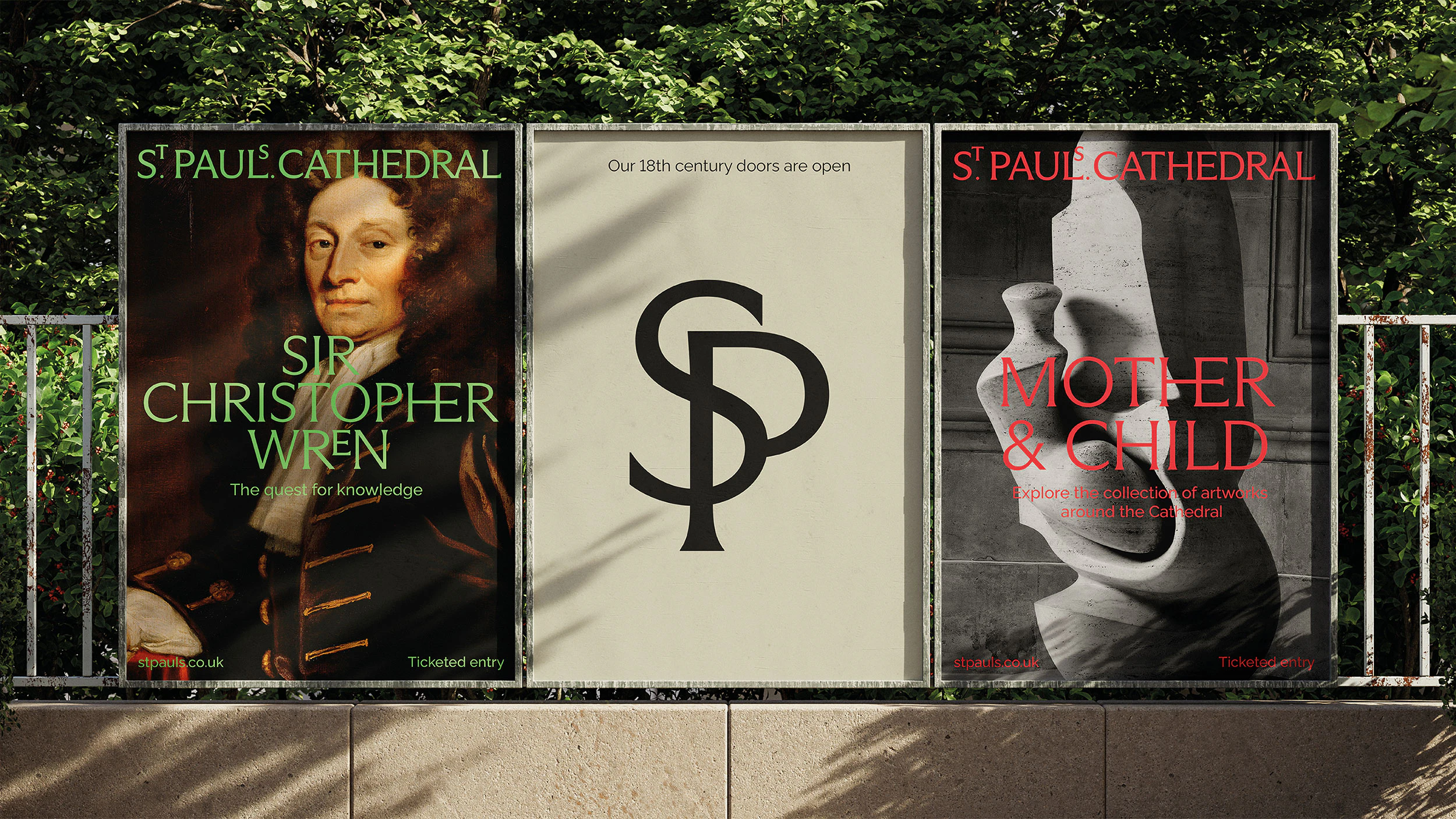
Pentagram’s identity for St Paul’s Cathedral does far more than make a historic institution look contemporary. It turns the cathedral’s history, stonecraft, typographic memory and civic role into the structural basis of a new visual system. The result is not merely a refined logo, but a coherent identity that reorganises how the institution appears, communicates and is remembered.
One of the project’s strongest decisions is the way the wordmark reinterprets historical references without imitating them. The elevated “S” and “T”, inspired by typographic details found in the Cathedral Library, create a quiet but distinctive character. History is not treated as decoration; it becomes raw material for a new design decision.
Typography works as an expression of institutional personality rather than ornament. Arizona Flare brings together classical letterforms and contemporary serif details, while Raleway establishes a calmer secondary voice. The palette, drawn from stone, floors and mosaics, further connects the identity to the physical reality of the building.
The project is valuable because it demonstrates that strong identity for a cultural institution is less about attracting attention than about producing belonging, continuity and character. In this context, timelessness emerges when form and meaning genuinely support one another.
History
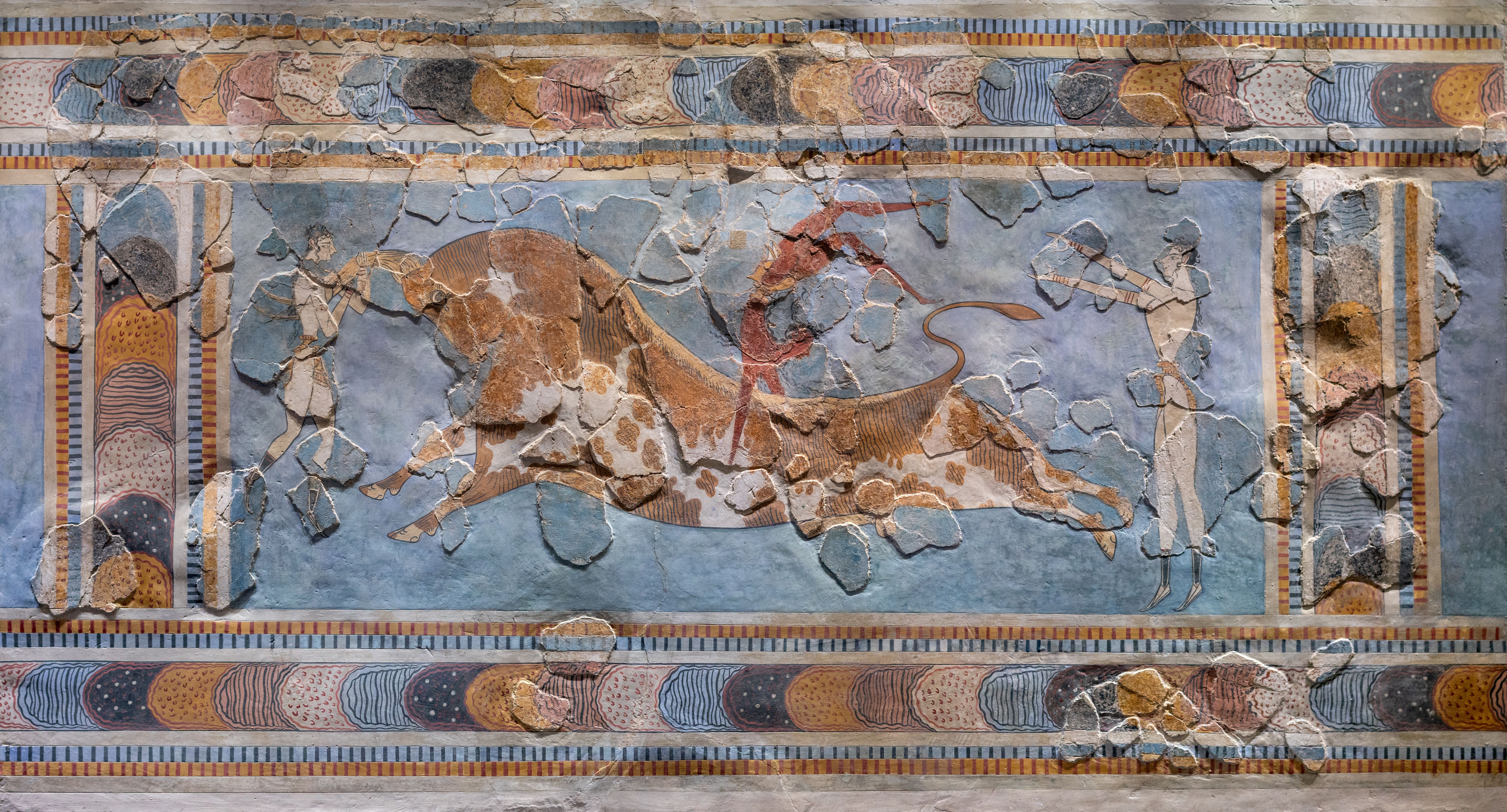
The Minoan fresco, especially the bull-leaping scene, is a remarkable reminder of how sophisticated image-making could be in early civilisations. What remains striking is not only its antiquity, but the continued vitality of its rhythm, motion and composition. The arrangement of figures, the tension of the bull and the use of colour show an image that is not merely descriptive, but ceremonial and symbolic.
The fresco does more than record a scene; it implies a worldview. Human bodies, animals, ritual and power meet on a single surface. That is why it should not be read as an archaeological object alone. It is also an early form of public representation and visual order. Even after time, damage and restoration, it retains an extraordinary persuasive force.
What makes it worth returning to is that it does not feel like inert history. It still carries an energy legible to a contemporary eye. Its stylisation, economy of line and treatment of movement make it an enduring lesson in visual intelligence.
Design
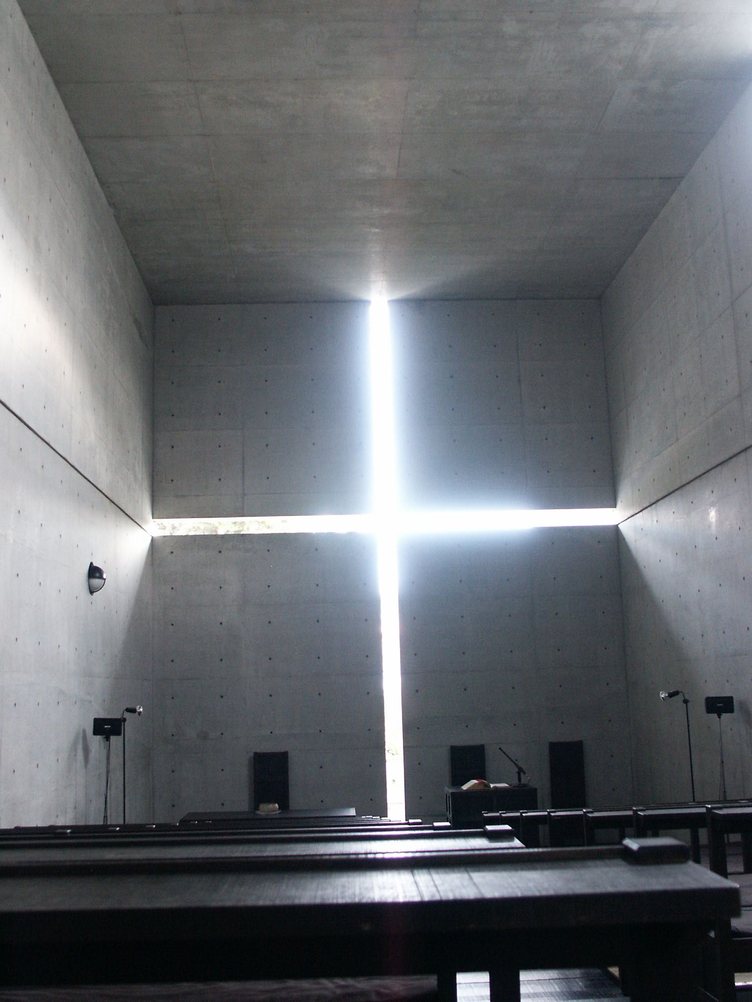
Church of the Light is one of the clearest demonstrations of Tadao Ando’s ability to achieve great intensity with very few means. The essential point is not simply the aesthetic use of concrete, but the way concrete becomes a frame for light and light becomes a spatial and almost spiritual event. The cruciform opening in the wall is more than a symbol: it structures the room, sharpens perception and places the visitor at the meeting point of the material and the immaterial.
What Ando achieves here is a sacred atmosphere without relying on ornament, iconographic abundance or material richness. Instead, he works through proportion, void, surface and illumination. The silence of the concrete intensifies the presence of light; the wall is not background, but an active partner. The building’s power lies in its ability to make a seemingly reduced vocabulary feel emotionally expansive.
Its importance is not that it looks minimal, but that it uses minimal means to generate a layered sensory and intellectual experience. It remains a lasting lesson in how architecture can produce awareness rather than merely form.

Music
Spread Your Wings is not among Queen’s loudest or most spectacular songs, and that is exactly why it stands apart. Written by John Deacon, it takes seriously the quiet drama of an ordinary person trying to move beyond the limits assigned to him. Sammy is not a heroic archetype; he is someone trapped in a small life, told by authority that he lacks ambition. The song’s achievement lies in treating that modest desire for freedom with real gravity.
Musically, the track pulls back from Queen’s more theatrical extremes and builds something more measured and intimate. Freddie Mercury’s performance is powerful not because it is extravagant, but because it feels deeply committed. The chorus rises less like a slogan and more like the emergence of suppressed will. Deacon’s compositional intelligence is evident in the song’s structural clarity and melodic restraint.
Lyrically, it is both personal and social. Sammy’s story belongs to one individual, yet the dismissive voice of the boss and the sense of being held in place belong to a much wider world. That is why the song remains affecting: it turns freedom into a lived emotional problem rather than an abstract ideal.
Cinema
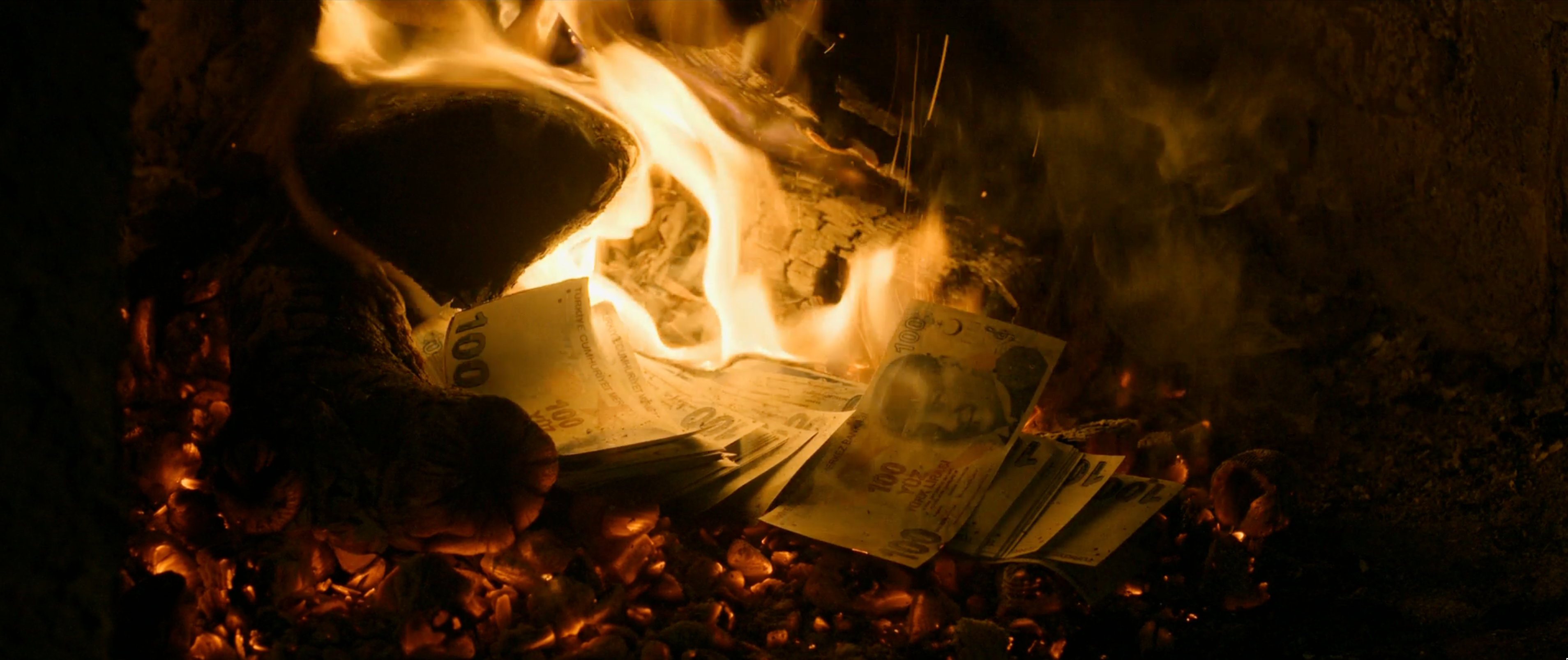
This scene is one of the moral as well as dramatic centers of Winter Sleep. Nihal’s attempt to compensate for an injustice through money appears charitable on the surface, yet it exposes the fragile relation between class, conscience, dignity and power. When İsmail burns the money, he is not simply refusing assistance; he is rejecting the hierarchy embedded in the gesture, the delayed mercy and the humiliation that accompanies it. The scene refuses easy emotional comfort. Its force comes from the fact that no one is fully innocent and no one is entirely wrong.
What makes the sequence unforgettable is the way it creates enormous pressure without slipping into melodrama. Camera, space and performance work together to make the tension palpable. Money becomes more than an economic object; it carries guilt, anger, pride, class resentment and the desire for moral repair. The fire consumes not only the banknotes, but also the possibility of easy reconciliation.
The moment gains its full power because Ceylan stages it not as an isolated incident, but as an eruption of accumulated silence, shame, resentment and arrogance. İsmail’s action may appear irrational, but that irrationality is precisely what shows that dignity cannot be reduced to economic logic. It remains one of the clearest and most disturbing representations of class and moral injury in contemporary Turkish cinema.
Design
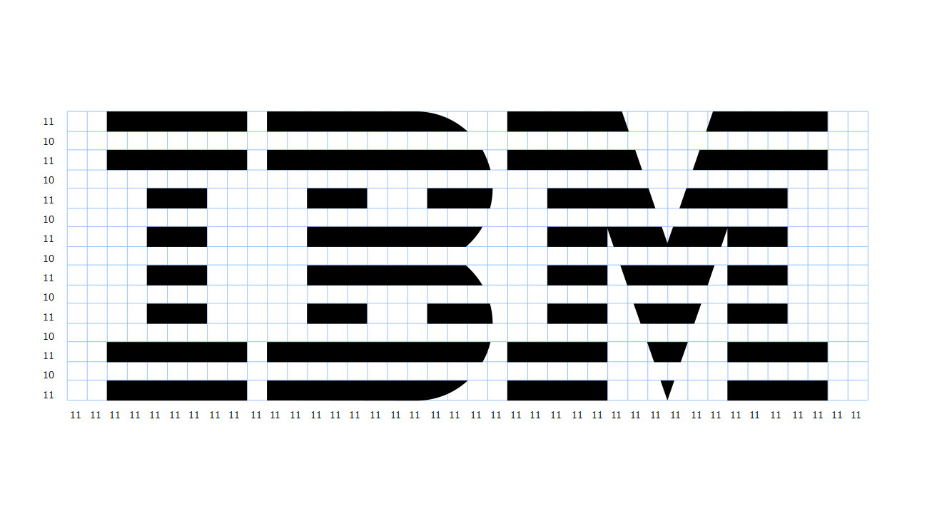
A logo’s timelessness has less to do with how striking it looks at first sight than with how clearly it can preserve its identity over time. Paul Rand’s IBM 8-Bar mark is one of the strongest examples. Its basic form has remained essentially unchanged since 1972, which is a result not only of recognition but of formal discipline.
What makes the mark interesting is that its apparently simple structure is optically very precise. Eight horizontal bands construct the letters through rhythm and negative space rather than through conventional outlines. This gives the mark a sense of technology, movement and continuity. Even the black and white bands are not mathematically identical in weight; IBM’s own guidelines describe optical adjustments that make them appear balanced. It is a reminder that strong identity depends on visual correctness, not merely geometric correctness.
A second condition of timelessness is independence from short-lived fashion. The IBM mark emerged from the modernist language of the 1970s, yet it does not feel trapped in that decade because its character comes from proportion, repetition and typographic structure rather than decorative effects.
Consistency matters just as much. Clear-space rules, scale relationships, positive and reversed versions, and careful optical adjustments protect the mark from arbitrary use. Over time, the logo becomes more than a graphic device; it becomes a carrier of institutional memory.
The real goal of a strong logo, then, is not to look modern. It is to be flexible enough to survive changing media while remaining distinctive enough not to lose its identity. Sometimes a few lines and the right proportions can achieve what layers of visual effect cannot: remaining recognisable, credible and current for decades.