IBM 8-Bar: What Makes a Logo Timeless?
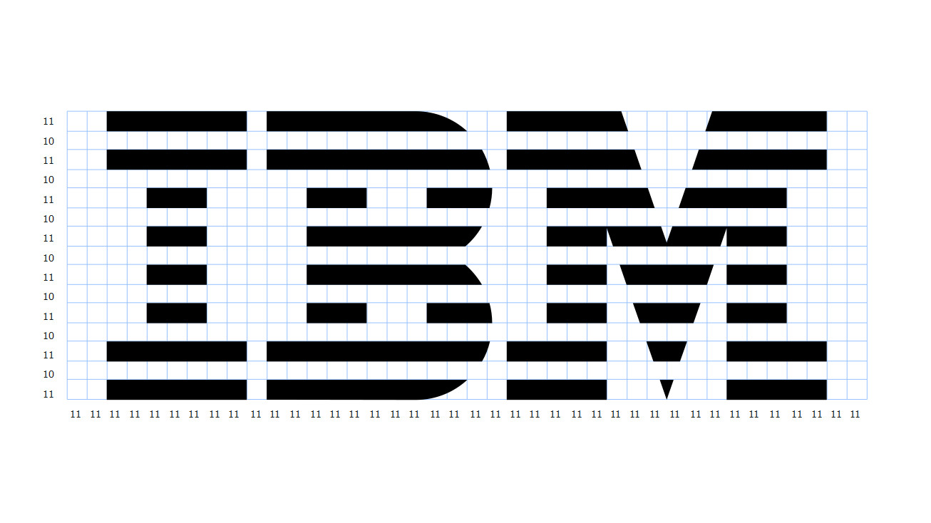
A logo’s timelessness has less to do with how striking it looks at first sight than with how clearly it can preserve its identity over time. Paul Rand’s IBM 8-Bar mark is one of the strongest examples. Its basic form has remained essentially unchanged since 1972, which is a result not only of recognition but of formal discipline. What makes the mark interesting is that its apparently simple structure is optically very precise. Eight horizontal bands construct the letters through rhythm and negative space rather than through conventional outlines. This gives the mark a sense of technology, movement and continuity. Even the black and white bands are not mathematically identical in weight; IBM’s own guidelines describe optical adjustments that make them appear balanced. It is a reminder that strong identity depends on visual correctness, not merely geometric correctness. A second condition of timelessness is independence from short-lived fashion. The IBM mark emerged from the modernist language of the 1970s, yet it does not feel trapped in that decade because its character comes from proportion, repetition and typographic structure rather than decorative effects. Consistency matters just as much. Clear-space rules, scale relationships, positive and reversed versions, and careful optical adjustments protect the mark from arbitrary use. Over time, the logo becomes more than a graphic device; it becomes a carrier of institutional memory. The real goal of a strong logo, then, is not to look modern. It is to be flexible enough to survive changing media while remaining distinctive enough not to lose its identity. Sometimes a few lines and the right proportions can achieve what layers of visual effect cannot: remaining recognisable, credible and current for decades.
View source ↗Back to references