Essay
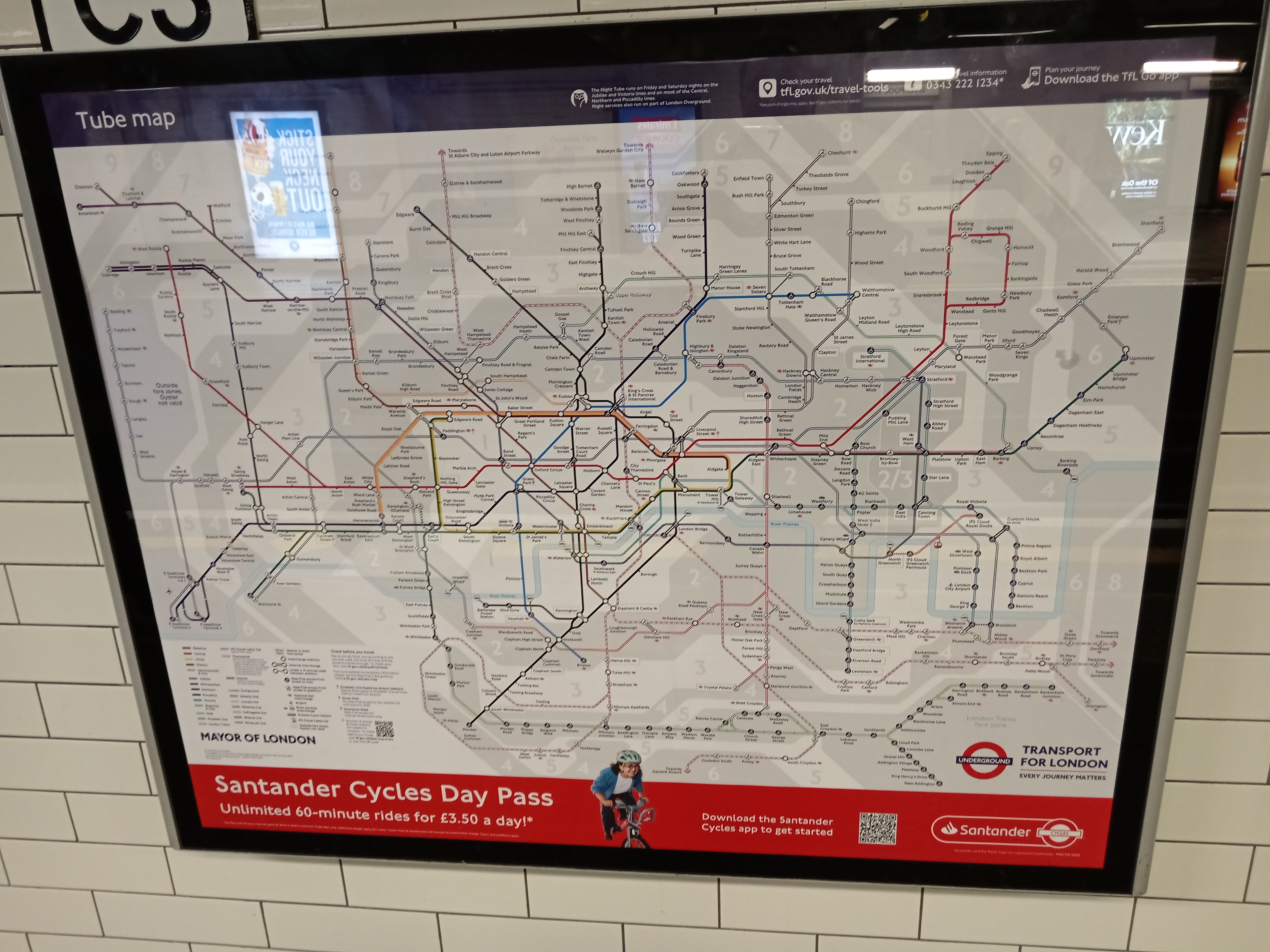
What a map chooses to leave out
From Harry Beck’s London Underground diagram to Vignelli’s New York subway map: what a map leaves out may matter as much as what it shows.

Notes on design, places, culture, technology and the things that gain meaning over time.
From Harry Beck’s London Underground diagram to Vignelli’s New York subway map: what a map leaves out may matter as much as what it shows.

An interest begins, and books, lessons and to-do lists soon follow. How much room remains to explore an interest when every curiosity is expected to lead somewhere?

From Giacomelli to Vivaldi, from Farinelli to Cecilia Bartoli: the same melody across two operas and three centuries of changing identity.

Reinterpreting the atmosphere of the past for contemporary needs is what separates nostalgia from imitation in design.

Square metres alone do not explain spatial experience. Proportion, light, sightlines and circulation can create a sense of generosity beyond physical size.
The best technology is not always the most visible. Sometimes a system succeeds precisely because the user does not have to think about it.

Urban memory is built from more than monuments. Scale, sound, thresholds, material and everyday rhythms give a place its character.

Price is visible; refinement usually appears in proportion, detail, judgment and restraint.

Strong design does not always try to attract attention. Often, its power comes from removing what is unnecessary and allowing what matters to become clear.

Some spaces, objects and ideas become more meaningful rather than less valuable as time passes. Lasting value is less about resisting the new than understanding the difference between what is temporary and what endures.