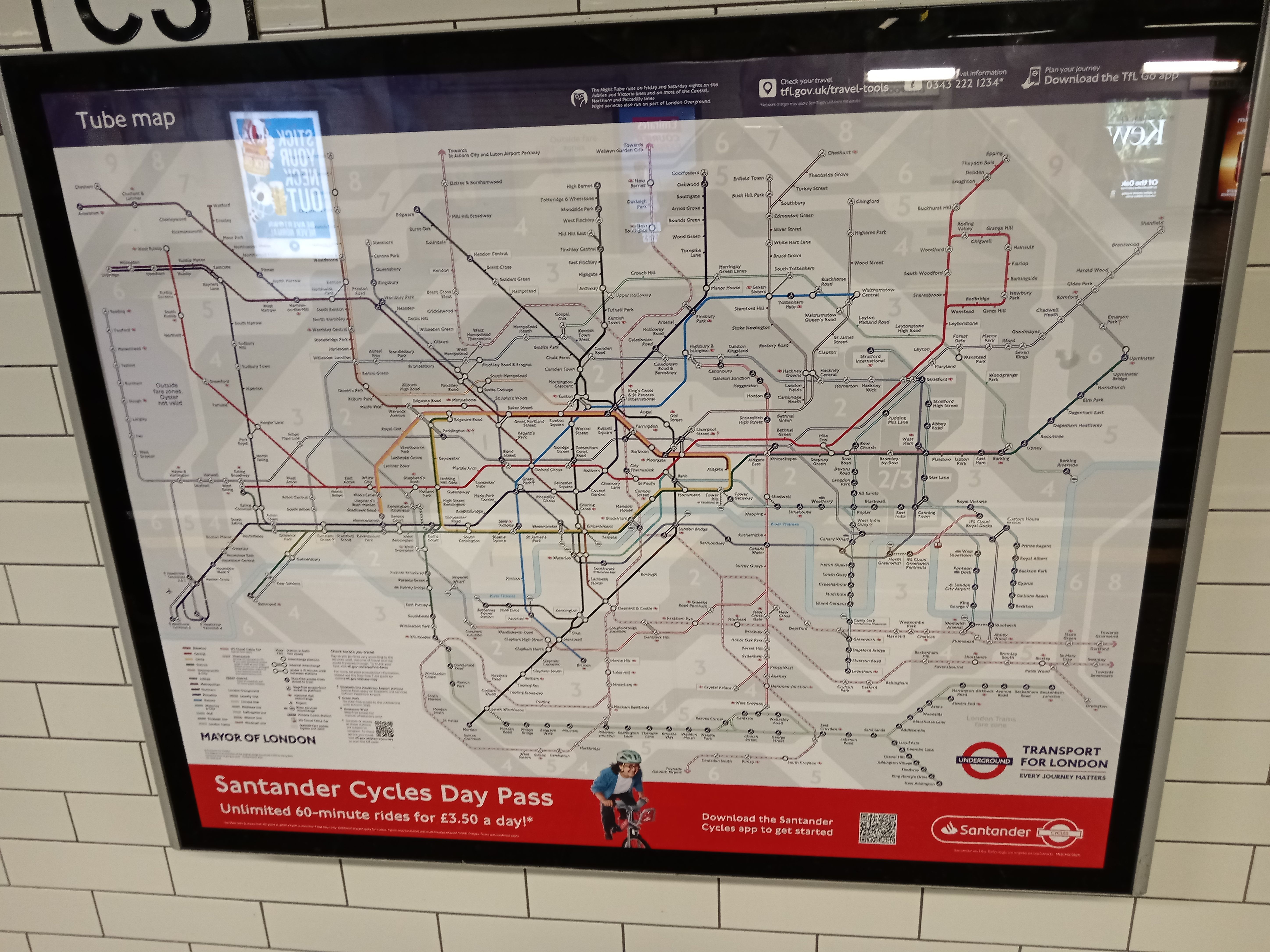
Someone travelling from Leicester Square to Covent Garden looks at the London Underground diagram and sees one stop on the Piccadilly line. Descending to the platform, taking a train and emerging at the next station seems reasonable enough. Yet walking between the two stations takes only a few minutes. The diagram is not wrong. It is answering a different question. By showing how places connect beneath the surface, it sets aside the streets above and the physical distance between them.
This small discrepancy opens up a larger question about the design of maps. Every representation is an act of selection. A city cannot be contained in full on a sheet of paper or a screen. Some relationships must be enlarged, others compressed, and some information omitted entirely. The value of a map lies not simply in how accurately it depicts the world, but in which truths it makes visible by putting others aside.
Drawing relationships instead of geography
As London’s underground railways multiplied, representing them with geographic fidelity became increasingly difficult. In the centre, station names collided; lines extending to the suburbs strained the limits of a pocket-sized map. But passengers did not need to know precisely which streets the tunnels passed beneath. They needed to find a line, identify an interchange and count the stops to their destination. Simplification was a response to a problem of use before it became a celebrated aesthetic.
Harry Beck, who had worked as an engineering draughtsman for London Underground, devised a different solution in 1931. His diagram reached passengers in 1933. He brought the lines towards horizontal, vertical and 45-degree directions, regularised the space between stations, opened up the crowded centre and compressed the edges of the city. Recalling the language of electrical circuit diagrams, his drawing described the logic of a network rather than the shape of the city. What now looks inevitable was initially considered too radical.
Beck’s achievement was not the removal of detail but the establishment of a hierarchy among details. The clarity of an interchange became more important than the true angle between two stations. The diagram retained a draughtsman’s rigour while becoming an ordinary object of daily use. There was a price. Two stops that appeared far apart on paper might be close together on the street; stations spaced evenly along a line need not be equally distant in reality. This was less a failure of the drawing than its deliberate boundary.
The park that became a square
The same method did not find the same reception in every city. For New York’s 1972 subway map, Massimo Vignelli’s team, with Joan Charysyn playing a central design role, organised the routes into precise angles and controlled relationships of colour. The network became a lucid graphic structure while geography receded. One famously unsettling detail was the near-square shape given to Central Park. For passengers carrying New York’s street grid in their heads, the abstraction could produce estrangement as readily as clarity.
In London, reading the underground as a system distinct from the city above had become familiar. In New York, many passengers also expected a subway map to offer clues about the streets they would emerge into. A drawing that clarified transfers could make relationships between neighbourhoods more elusive. In 1979, the Vignelli diagram gave way to the more geographically oriented map produced by Michael Hertz Associates. It would be too easy to call this a victory for truth over design. The competing maps tested different reading habits and different expectations of what a public diagram should provide.
That story did not end in 1979. In April 2025 the Metropolitan Transportation Authority introduced a new subway diagram openly inspired by Vignelli’s approach. Stronger route distinctions, straightened lines and simplified shapes revived a method that had once been criticised. More than four decades later, however, visual taste was not the only thing that had changed. Passengers now carried separate digital street maps in their pockets. The same design idea could acquire another meaning in an altered information environment.
One journey, two kinds of distance
Two stops adjacent on a diagram are not necessarily close for a person walking above ground; two stations that seem distant in the diagram might be separated by only a few corners. The distance of a transit network is measured in route sequence, connections and interchanges. Walking distance is shaped by the continuity of pavements, crossings, gradients, entrances and sometimes the weather. Leicester Square and Covent Garden make the difference immediately apparent. A map may be dependable within one frame of reference and much less helpful when that frame changes.
Different architectural drawings observe a similar division of labour. A site plan shows how a building relates to its surroundings; a floor plan shows the organisation of rooms; a section reveals levels, voids and height. None substitutes for the others. Even a plan drawn faithfully to scale cannot fully describe how a place will feel. A good drawing becomes more useful when it abandons the ambition to say everything at once. The more pertinent question is not simply what has been omitted, but which decision the drawing allows someone to make.
Yet omission is not always benign. A station appearing close on a diagram is no guarantee of step-free access. An interchange symbol can conceal a lengthy corridor, a wait for a lift or a tiring change in level. For travellers with reduced mobility, those details are not secondary; they may decide whether a route is possible at all. Rather than overcrowding one diagram with every kind of information, useful systems provide complementary layers that reveal walking connections, accessibility and other constraints when they matter.
The invisible editor inside the screen
Many maps now do more than describe a place: they make decisions on our behalf. A journey-planning application places the fastest route, the option with fewest changes or an estimated arrival time in front of us. This can be enormously helpful, but the ranking is never entirely neutral. An algorithm may prefer a six-minute transfer to an eight-minute walk. Those eight minutes, however, might include a square, a shop window, an unexpected view or renewed contact with the city. Value that is not measured is easily excluded from the recommendation.
This is not an argument for nostalgia or against technology. One of the great strengths of digital mapping is its ability to do what a printed diagram cannot: change with the circumstances. It can show walking distance, step-free access, temporary closures, service times or alternative entrances for the same journey. The design question lies in when these options appear and in what order. An interface that hides the criteria behind its suggestion may seem impressively knowledgeable. One that makes those criteria legible allows its user to become more knowledgeable too.
There need not be a single definitive map of a good city. A transport diagram speaks the language of the network, a street map the language of proximity, an accessibility plan the needs of different bodies, and a walking route the continuity of public life. None invalidates the others. The difficulty begins when one of them is mistaken for the whole city. A city is not merely the space between stops and destinations. Daily life takes place in those spaces: chance meetings, short cuts, interruptions and occasional diversions more valuable than the journey that prompted them.
If Beck’s drawing remains influential nearly a century later, it is not because it resembles London. It is because he understood exceptionally well what people needed to know at a particular moment. The return to Vignelli’s ideas decades later suggests something more than a renewed affection for handsome lines: a design solution can find another life as the expectations of its users change. Enduring design is sometimes about form, and sometimes about having asked the right question before drawing the first line.
Looking at a map, it is worth considering not only what it shows but what it quietly leaves outside the frame. Omission does not always make a drawing misleading; forgetting the nature of that omission often does. A good map need not claim to represent the whole world. It can open a way through it while leaving us aware that there is another world to discover beyond the diagram.